 |
|
 Sep 10, 2006, 08:34 AM // 08:34
|
#421 | |
|
Wilds Pathfinder
Join Date: Sep 2005
Location: 7°13'35" E - 50°06'27" N
Guild: Servants of Fortuna [SoF]
|
Quote:
 I liked your picture a lot (if I were to pick a top ten of this thread, yours would most certainly be in it). Just the right amount of highlighting and soft-focus - to me she really does look rather like one of those overedited photos of a model, like seen on a glossy magazine cover (and considering we're talking about a screenshot, that's meant as a compliment). Although I think there is a little flaw at her right arm (background shining through), or is that deliberate? |
|

|
 Sep 10, 2006, 02:04 PM // 14:04
|
#422 |
|
Desert Nomad
Join Date: Jan 2006
Location: Canada, Qc
Guild: [Holy]
Profession: Me/Mo
|
|

|
 Sep 11, 2006, 02:42 AM // 02:42
|
#423 |
|
Forge Runner
Join Date: Apr 2006
Guild: [HiDE]
|
Well thank you very much Oo
I was not expecting such a response. Anyway, with my mesmer deleted after only 4 hours of play. I decided to make an elementalists to take her name. Last edited by Vahn Roi; Sep 11, 2006 at 02:57 AM // 02:57.. |

|
 Sep 11, 2006, 02:44 AM // 02:44
|
#424 |
|
Forge Runner
Join Date: Jun 2005
Location: http://tinyurl.com/4g5ueb8
Guild: Put the peanut in the peanut hole!
|
That picture seems like one of those photos that have aged over time?
Like a really old picture-like effect. It's nice. :P |

|
 Sep 11, 2006, 02:47 AM // 02:47
|
#425 |
|
Forge Runner
Join Date: Apr 2006
Guild: [HiDE]
|
Thank you. I was going for a rougher, more aged look. The mesmer image was something of a fluke in fact >>
I donno, still perfecting it. |

|
 Sep 11, 2006, 03:21 AM // 03:21
|
#426 |
|
Lion's Arch Merchant
Join Date: Jun 2005
Location: California
Guild: Zealous Benediction [zB]
Profession: R/
|
Here's a simple one I did following Bethany's directions. Still getting the hang of photoshop.
|

|
 Sep 11, 2006, 03:33 AM // 03:33
|
#427 |
|
Forge Runner
Join Date: Apr 2006
Guild: [HiDE]
|
The angle makes it look like you're levitating. You may want to experiment with different perspectives as well as different types of cropping. It can make a world of difference.
|

|
 Sep 11, 2006, 08:41 AM // 08:41
|
#428 |
|
Pre-Searing Cadet
Join Date: Sep 2006
Guild: Dragonian Marauders
Profession: Mo/R
|
Hello, this is my first time posting on these forums. I just followed the tutorial on the second page of this thread, and nothing else. I think it came out all right. EDIT: In my rush to add my image to this wonderful collection, I forgot to thank you, Bethany, for providing such an informative tutorial. Not only have you shared such lovely images, but you've shown others how to create and share pieces equally as lovely. Thank you. 
Last edited by Nijan Narabi; Sep 11, 2006 at 08:47 AM // 08:47.. |

|
 Sep 13, 2006, 07:36 AM // 07:36
|
#429 |
|
Ascalonian Squire
Join Date: May 2006
Location: Colorado
Profession: W/Mo
|
My Ritualist, Mai Kinhari, outside Shing Jea Monestary:
and the original http://i10.photobucket.com/albums/a1...rve88/mai2.jpg |

|
 Sep 14, 2006, 04:17 AM // 04:17
|
#430 |
|
Frost Gate Guardian
Join Date: Jun 2005
|
@ Nijan. Thanks, your appreciation really flatters me. At the risk of repeating myself, never in my wildest dreams did I ever expected this thread to run such a course.
@Vahn Roi: I really like what you do, the aging and all. Perhaps you could give everyone the basics of your images. Ok. here's another small thing you *absolutely* need to do if you plan on showing your entire character: remove the blur around your character's feet otherwise he'll/she'll look like a paste-up. Also, keep in mind that images too big sort of mess the thread's format. If you can put your images 800 pixels wide, I'm sure it would be appreaciated. I'm using 1280 and I still have to scroll sideways for some images. Some of you have tried the comic book effect. I like it and it gives another dimension to screenshots. In essence, when you create something with PS or other image-enhancing software, take note of the steps you take and when you put it up here share your construction method. Sometimes another person can take your method and give it a new, interesting twist. As for lil 'ol me, still under a lot of work so the free time I have is spent outside, breathing oxygen and reconnecting with the human race. That is when I'm done with the usual chores. Last edited by Bethany; Sep 14, 2006 at 04:20 AM // 04:20.. |

|
 Sep 14, 2006, 07:54 AM // 07:54
|
#431 |
|
RAGE INCARNATE
Join Date: Apr 2006
Location: Sitting at The Guild Hall 2, being happy.
Guild: Nerd Clan [NK]
Profession: R/
|
Bethany is being kind with her request. The forum rules actually state anything over 640 needs to be url'd or thumbnailed... But this is a special thread so we'll allow Bethany to have the 800 for the pictures.
Remember, even though you may have a massive screen Res. There are users out there. (God help them.) That run the smallest possible screen res and as Bethany, even running 1280 we have to scroll side to see stuff... Be considerate of others... What would be a great help to your moderators, would be if you could go in and change the pictures yourselves instead of making us look through every page of this thread and edit every single post... You prolly have no idea how long that would take specially if the forums decide to become funky. |

|
 Sep 14, 2006, 01:08 PM // 13:08
|
#432 |
|
Academy Page
Join Date: May 2006
Location: The Netherlands
Profession: W/
|
my warrior ( Wickie The Vicking )
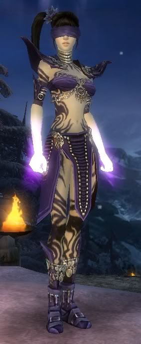 My Necro ( Jessica Blueblood )  Spend also a few minutes with PS. |

|
 Sep 14, 2006, 07:12 PM // 19:12
|
#433 |
|
Desert Nomad
Join Date: Jan 2006
Location: Lost in the sands of time...
Guild: Blood Of Orr [BoO]
Profession: R/Rt
|
My first attempt at it, its not that great, but i like it pretty well =) Im going to keep working with this.
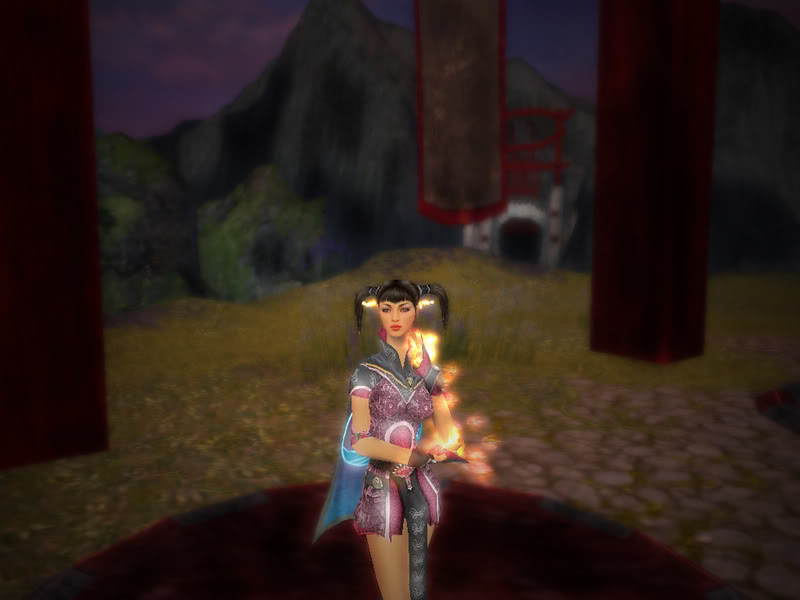 The original: http://i31.photobucket.com/albums/c3...eyes/gw193.jpg |

|
 Sep 14, 2006, 07:58 PM // 19:58
|
#434 |
|
Frost Gate Guardian
Join Date: Jun 2005
|
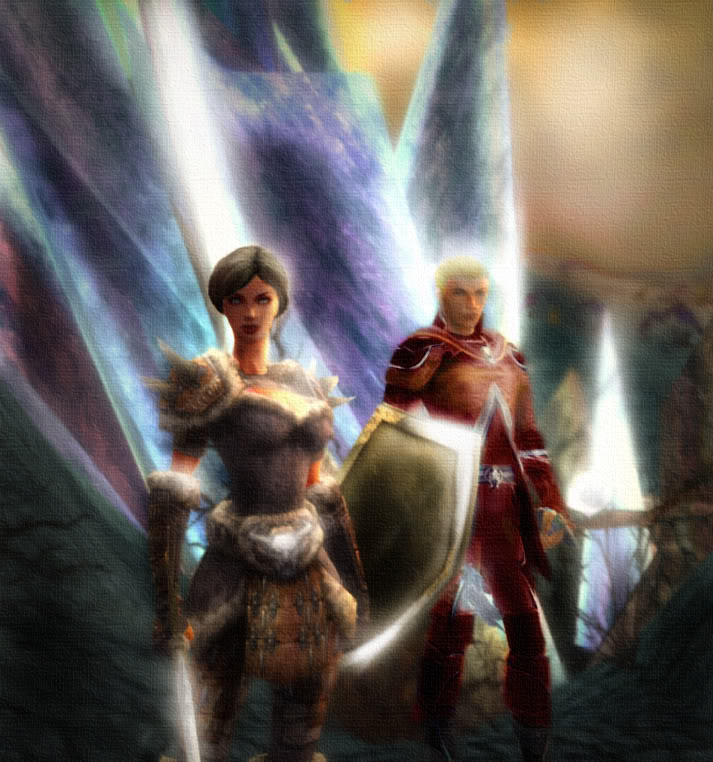
Here's my recent jobbie, using Bethany's guide as a starting point. I've been using Photoshop for years, so a lot of it was just stuff I added on my own.
Last edited by Sable Phoenix; Sep 15, 2006 at 12:58 AM // 00:58.. |

|
 Sep 14, 2006, 08:02 PM // 20:02
|
#435 |
|
Desert Nomad
Join Date: Jan 2006
Location: Lost in the sands of time...
Guild: Blood Of Orr [BoO]
Profession: R/Rt
|
made another one, i like this one better than my first one
original: http://i31.photobucket.com/albums/c3...eyes/gw165.jpg 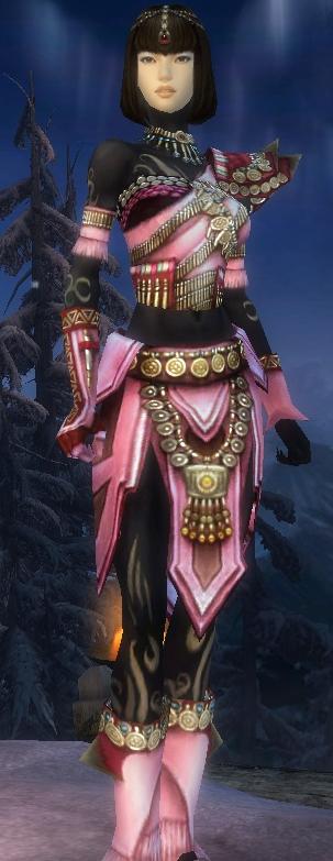
|

|
 Sep 14, 2006, 10:22 PM // 22:22
|
#436 |
|
Frost Gate Guardian
Join Date: Jan 2006
Location: USA
Profession: Mo/
|
First attempt for me, featuring my main character Azinna Videl. I use PSP 8 so I couldn't go by the guide word for word.
|

|
 Sep 15, 2006, 12:38 AM // 00:38
|
#437 |
|
Frost Gate Guardian
Join Date: Jun 2005
|
@Unlucky Slayer: Thanks for the help. 800 pixels wide would be an absolute maximum. Larger than that not only forces you to scroll sideways but prevents us from seeing the image as whole.
@Wickie: I really like your first one. Nice setup and presentation. The second one looks strange as your character looks like a "paste-up" on a blurred backdrop. @xxSilhouette: For a first attempt I'd say it's really good. Always keep in mind that a good image needs a good setup first. Never be afraid to take multiple screenshots; check differents areas, hike to places you haven't gone yet and play with the camera. @Sable Phoenix: I really like what you did. Looks like paint on a canvas. Can you enlighten us with the steps, please? xxSilhouette: Yep, second one looks even better. The only thing I see are some areas around the body which need a more precise erasing; shoulders and arms. Zoom in on your image as much as needed for the erasing. bryann380: I'm not familiar with PSP but I'd say you did a pretty decent job here. Only one thing; the colors of the backdrop are vivid but your character's skin looks, well, pale. Unless that's her original skin color. Because as I see it, the backdrop catches the eye first because of the colors, then to the character. |

|
 Sep 15, 2006, 02:32 AM // 02:32
|
#438 | |
|
Desert Nomad
Join Date: Jan 2006
Location: Lost in the sands of time...
Guild: Blood Of Orr [BoO]
Profession: R/Rt
|
Quote:

|
|

|
 Sep 15, 2006, 03:28 AM // 03:28
|
#439 |
|
Frost Gate Guardian
Join Date: Jan 2006
Location: USA
Profession: Mo/
|
Azinna does have pale skin. I'll be working on another pic of her soon.
|

|
 Sep 15, 2006, 04:16 PM // 16:16
|
#440 |
|
Pre-Searing Cadet
Join Date: Sep 2006
Profession: W/Mo
|
Been watching this thread for a while and the great work going on, thought I would give it a try.
Here's the original 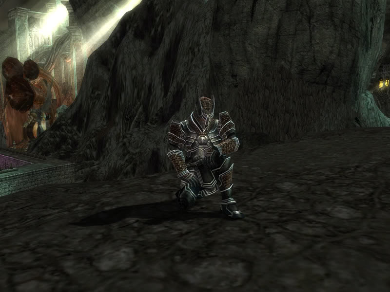 And here is the after 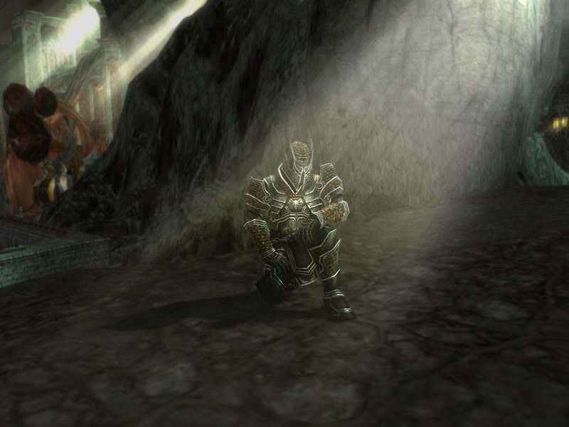
Last edited by (8)Ball; Sep 16, 2006 at 01:25 AM // 01:25.. |

|
 |
|
«
Previous Thread
|
Next Thread
»
| Thread Tools | |
| Display Modes | |
|
|
All times are GMT. The time now is 03:21 PM // 15:21.


 Linear Mode


